NFT Marketplace Configuration
An Eluvio LIVE Marketplace object contains links to NFT Template objects and other metadata that allow the corresponding NFTs to be viewed on a storefront, claimed or purchased, and minted.
By default, the Marketplace object is within the Properties Library. In the Fabric Browser, it is possible to configure the Marketplace object metadata by clicking the Manage button while on the detail view of the Marketplace object. This loads the App tab GUI for editing metaddata.
Initial Setup
There are a large number of marketplace customization options, but only a few fields are required to get started.
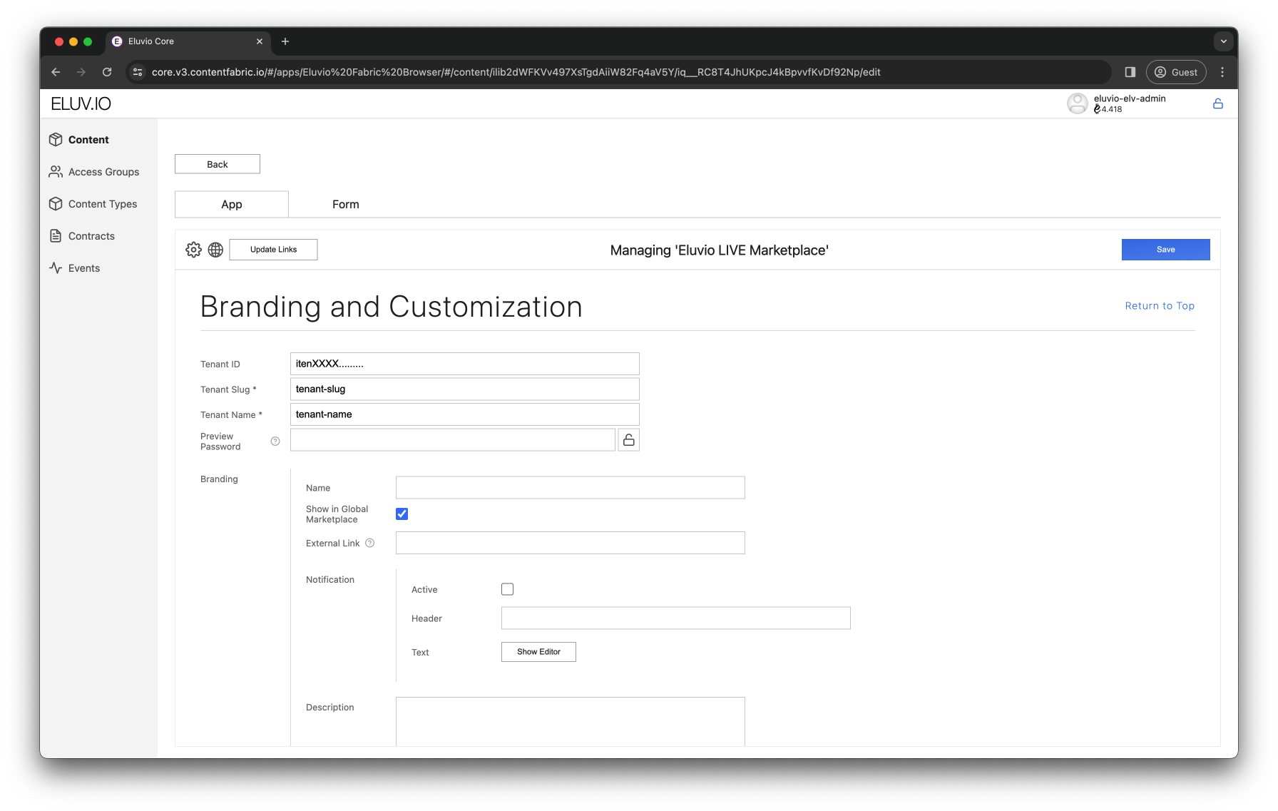
- Ensure the Tenant ID is set to the
itenvalue associated with your tenancy. - Ensure the Tenant Slug is set to the same value as the Slug field on your Eluvio LIVE Tenant object.
- It is recommended to set a password that will be used in the Preview environment to view changes that have not yet been pushed to Production.
- Click the lock icon to clear the field, enter a password, and then click the lock to set and hide the password.
- It is still necessary to Save and update the object tree in order for the password to take effect.
- Keep in mind that you will not be able to recover the password once you save it. However, it is possible to set a new password by clicking the lock icon again and entering a new password.
Adding Marketplace Items
You must add a marketplace item within the marketplace object metadata for each NFT that you intend to make available for minting. When adding items, there is once again a variety of customization options, but only a few are essential. Any of these values can be changed at any time.
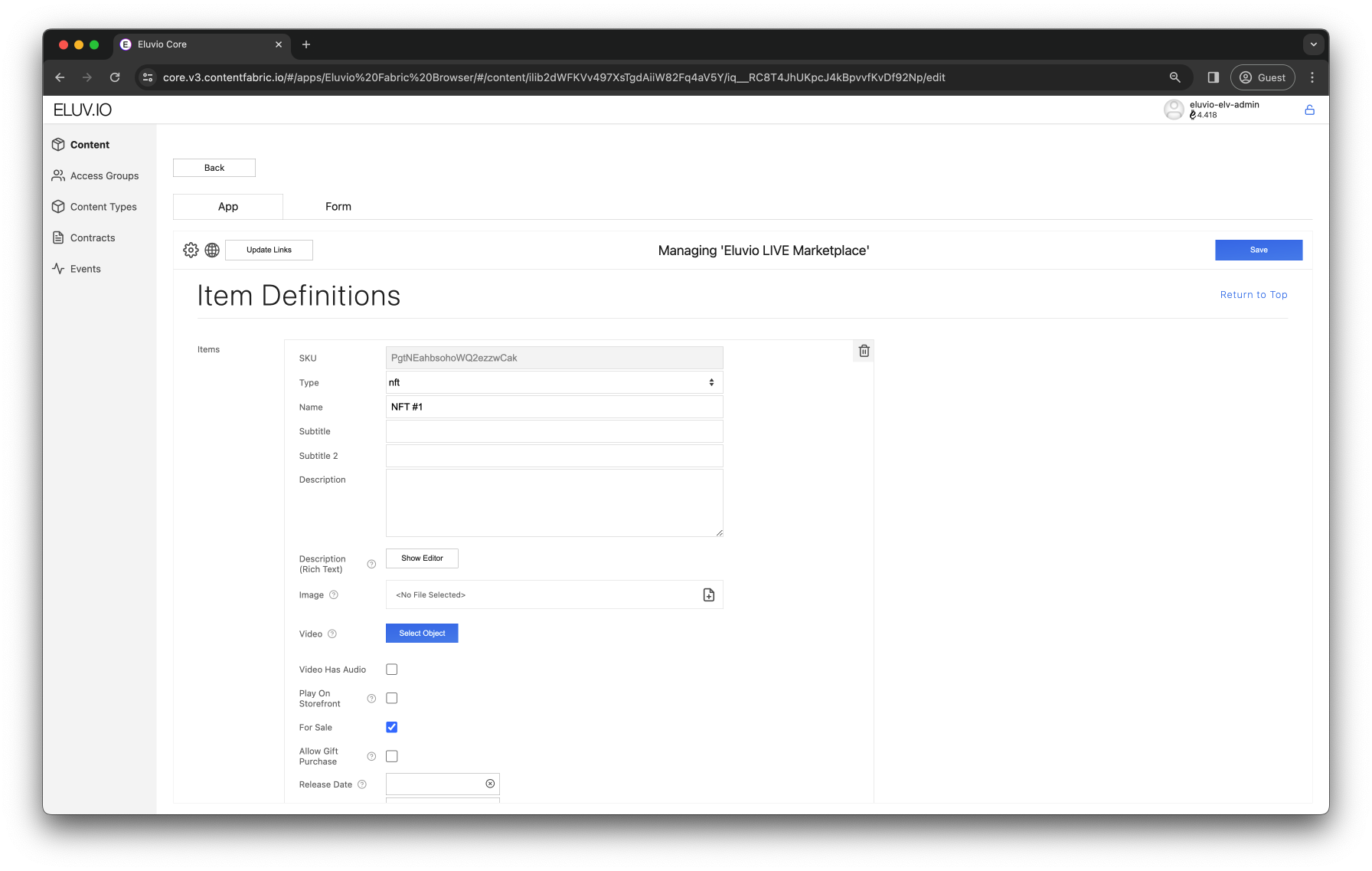
Under “Item Definitions”, click the “Add Items” button to generate a SKU and set of metadata for a new item on the marketplace. These are the essential metadata fields to supply:
- Enter the “Name” as the Name you’d like the NFT to show on the Store.
- Check “For Sale” if the item will be directly purchaseable or claimable on the Store. If it is a pack item or if the item is not ready to be minted, this can be left unchecked.
- If “For Sale” is unchecked you have the option to make it “Viewable”. This makes the item appear on the storefront and available for users to see the drilldown view, but not actually for them to purchase or claim.
- “Max Purchasable per User” indicates how many of an item a user can purchase from the store in total. Please note that users can still end up a higher number than this value in their wallet if they purchase the item on the secondary marketplace. This must explicitly be set to 1 if the NFT is free. If the NFT is not free this can be left blank to indicate that there is no limit.
- “Free” should be checked if the item can be claimed once per user at no charge to them.
- “Price” is how much a user will pay prior to additional fees to purchase the item. It should be left blank if the item is free, rather than set to zero.
- “NFT Template” is where you will need to specify the NFT Template object that corresponds to the item.
There are additional fields that allow more precise control over the appearance and availability of the item:
- Enter “Subtitle”, “Description”, “Description (Rich Text)”, and select an “Image” ONLY if you want to override what already exists in the NFT Template metadata.
- Add a “Video” if you would like a video to play instead of the NFT Template thumbnail when the user is browsing the item drilldown.
- If you’d like the user to be able to play the video with its audio, check “Video Has Audio”
- If you’d like the video to play on the storefront landing page as well as the item drilldown, check “Play on Storefront”. Note that too many videos playing on the storefront at once may significantly increase loading time.
- “Release Date” and “End Date” correspond to the range of dates when your item will be available for purchase or claiming. If “Release Date” is left empty, the item will be available for sale immediately. If “End Date” is left empty, the item will be available indefinitely.
- Checking “Show if Unreleased” makes the item appears on the storefront, but there is no button for users to view the drilldown unless the subsequent “Viewable if Unreleased” is also checked.
- “Requires Permissions” needs to be checked if there is a policy in place that restricts access to the NFT. The NFT can be hidden or shown with a message if permission is not granted.
- “Max Purchaseable per Checkout” indicates how many of an item a user can purchase from the store with a single transaction. If the NFT is free or there is no limit, this value should be left blank. If left blank, the limit is implicitly:
- 1 if the item is free
- equal to the “Max Purchaseable per User” a value for that is specified and if the item is not free
- no limit if “Max Purchaseable per User” is left blank as well.
- “Hide Number Available” hides display of the cap from certain views in the store (but not all)
- “Tags” are used in interaction with Eluvio LIVE Drop Event objects to filter display of storefront items in certain contexts.
- “Use Analytics” can be used to track user interactions with the item.
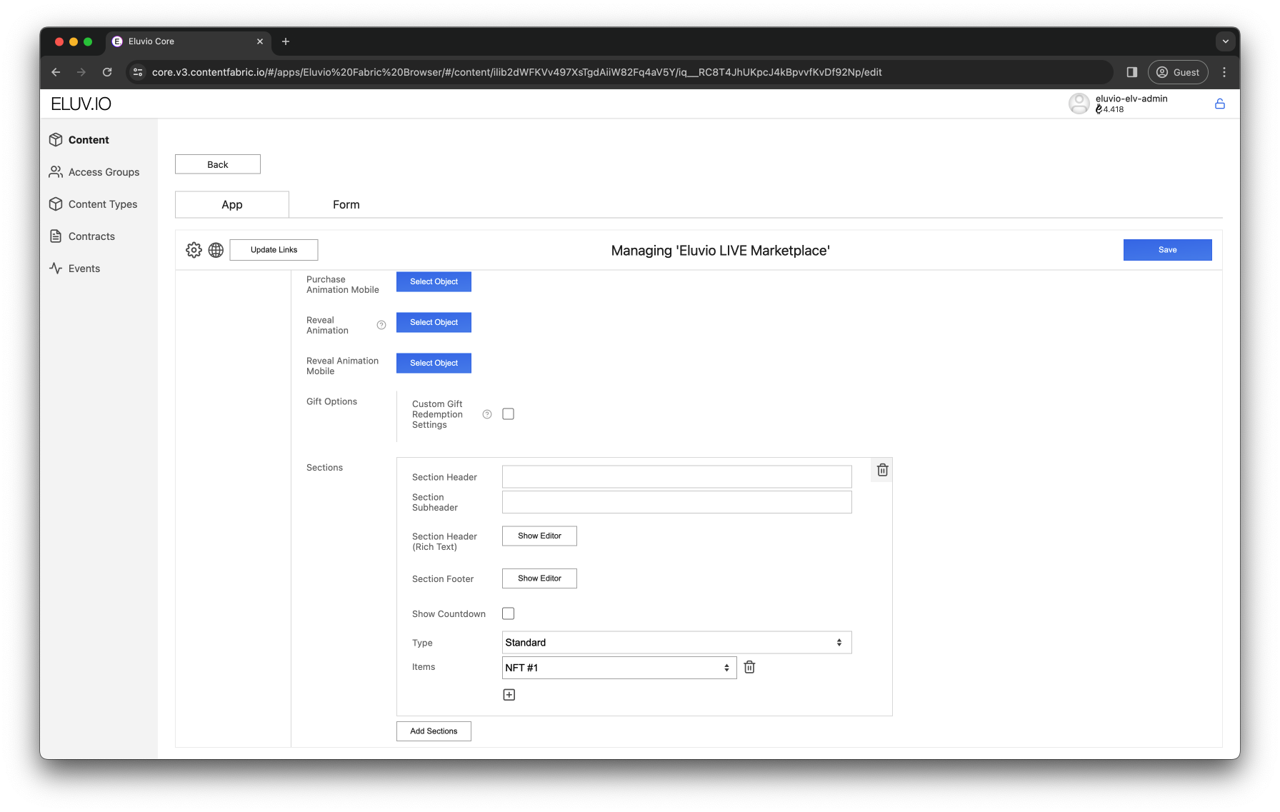
Configuring Store Sections
Even if the items are configured correctly for sale, they will not appear on the marketplace storefront page unless they are added to a Section in the Storefront Organization Section.
Click Add Sections in the Sections area for each Section you would like on the store. Sections appear as horizontally delineated areas on the storefront with one or more items in each. Sections can have headers, subheaders, and appear in several different ways:
- If Type is Standard, the item will appear in a grid format with other items side-by-side.
- If Type is Featured, the item will, on desktop, appear on its own in a large size with title and description to the side (item visual specified as Left or Right)
- If there are multiple items in a Featured Section, a small scroll bar will appear underneath for users to scroll between items.
- If Show Carousel Gallery is checked, then a row of thumbnails will show underneath the scroll bar, which the user can click to toggle between items.
- On mobile, the view reverts to Standard.
Propagate Changes to Staging & Production
- Update Links button under Manage in Tenant’s “LIVE Tenant” object if all objects are ready to go to production
- If only certain objects should be updated, click the up arrow symbol next to the links that should be updated and click Save
- At this step, consult Eluvio if an update to the Staging environment is required.
- Updates to the Production environment can be made by the admin user using the command
./elv-live tenant_publish_data <Tenant ID>
- After updating production, this command can be run to verify all marketplace items (it will provide warnings at the end of output if issues are detected):
./elv-live tenant_show <Tenant ID> --check_nfts
Marketplace Troubleshooting
As first steps:
- Ensure all object links are up-to-date through the top level.
- Empty Cache and Hard Reload in your browser, then try your action again.
If these do not resolve the issue then refer to the below.
If site does not load:
- Check all slugs specified in event, marketplace, and tenant objects (including for whitespace)
“We’re sorry, something went wrong” when loading Store:
- There may be an item e.g. Marketplace Banner that is missing info and needs to be filled or removed
Missing item may be due to:
- “For Sale” not being checked
- Item not having been added to a store section
- Policies not set up correctly or conditions not met on a “Requires Permissions” NFT
- Incorrect permissions on NFT Template (should be Public or Publicly Listable)
Premature “Sold Out” message may be due to:
- Inappropriate file specified in the NFT Template’s Media field
- Contract still being new (wait ~5 minutes)
Pack Open failures may be due to:
- Pack contents not configured as Marketplace Items
- One or more pack contents have an exhausted supply
No response when clicking claim button may be due to:
- Purchase Limit on Free NFT not 1
Payment errors (stalled or “Purchase Failed” when loading Stripe/Coinbase) may be due to:
- Price field being blank when updated to production but nonblank when updated to staging for testing
Stalled minting may be due to:
- Incorrect Tenant ID on Marketplace or Drop Event objects
- Minting cron job not running for this tenant/marketplace (consult with Eluvio for this)
“Minting Failed” may be due to:
- Incorrect or absent configuration of minter on tenancy (consult with Eluvio for this)
Styling Customization
Once a tenancy is created and the marketplace object configured, the tenant admin should set the ’theme’ of the marketplace to Custom. This will allow customization of the marketplace’s CSS through the fabric browser by simply setting the desired values to specific root variables. In order to avoid any issues in terms of styling, we highly recommend customizing your site by solely changing the values of the following root variables instead of trying to override any styling with custom stylesheets.
CSS Variables
You will be able to make a custom theme with relatively few variable changes since most component variables reference general defaults. The following are the variables that are given custom values and reused throughout the different components.
- BACKGROUND: change site’s main background color. Primary sets header, filter and stats background colors. Secondary provides a different row shade to Activity table. Add media to your background using the content variable.
        --color-page-bg
        --color-bg-primary
        --color-bg-secondary
        --background-content
        --border-radius-page-content
- FONT: import your desired fonts using CSS format. Primary used for headers, tertiary used for buttons and secondary for all the rest.
        --font-family-primary                  /* Primary font should be accompanied with 'text-transform: uppercase' */
        --font-family-secondary
        --font-family-tertiary
        --font-default
- FONT COLOR: set color of site’s text. Primary changes main text (headers, titles, stats, prices). Secondary changes descriptive text. Error sets color of alert messages. Highlighted text can be changed using either HEX or RGBA color system.
        --color-text-primary
        --color-text-secondary
        --color-text-error

        --color-text-highlight
        --color-text-highlight-rgb
- BORDER: sets border of tables, stats, filters. Faint and highlight variables provide the opportunity to differentiate edges and lines. Use the border parameter variables (radius, color) to fill in the necesary border values.
        --border
        --border-faint
        --border-highlight
        --border-radius
        --border-color
        --border-color-faint
        --border-color-highlight
- CARDS: NFT cards displayed on the marketplace are styled with the below variables.
        --background-marketplace-card
        --color-marketplace-card-text-primary
        --color-marketplace-card-text-secondary
        --border-marketplace-card
        --border-marketplace-card-logo
        --border-radius-marketplace-card
For the rest of the global variables (listed below) we highly recommend you simply interpolate their values with the ones above. This will decrease the amount of overlapping CSS values and parameters as well as avoid rendering issues.
- SITE HEADER
        --font-header-links
        --font-header-profile
        --font-header-balance
        --font-store-header

        --background-page-header
        --color-page-header-text;
        --color-header-link-text
        --color-header-link-text-active

        --background-marketplace-header
        --color-marketplace-header-text

  - MARKETPLACE HEADER

        --font-store-heading
        --font-store-subheading
        --font-store-link

  - BUTTONS

        --font-button
        --font-button-selection

        --background-button-primary
        --color-button-primary-text
        --border-button-primary
        --border-radius-button-primary

        --background-button-secondary
        --color-button-secondary-text
        --border-button-secondary
        --border-radius-button-secondary

        --background-button-danger
        --color-button-danger-text
        --border-button-danger
        --border-radius-button-danger

        --background-button-selection
        --color-button-selection-text
        --border-button-selection
        --border-radius-button-selection

        --background-button-selection-active
        --color-button-selection-active-text
        --border-button-selection-active
        --border-radius-button-selection-active

  - INPUT FIELDS

        --font-input

        --background-input
        --color-input-bg-solid
        --color-input-hover-bg
        --color-input-text
        --color-input-text-placeholder
        --color-input-highlight-bg
        --color-input-highlight-text
        --border-input
        --border-radius-input

        --box-shadow-input
        --box-shadow-input-focus
        --outline-input-focus

  - LISTINGS AND ITEMS CARDS

        --font-card-title
        --font-card-text
        --font-card-misc

        --background-card
        --color-card-bg
        --color-card-text-primary
        --color-card-text-secondary
        --color-card-text-highlight
        --box-shadow-card

        /* Cards and feature cards have borders implemented as a padded element with a colored background */
        --border-background-card
        --border-width-card
        --border-radius-card

        --color-card-stock-available
        --color-card-stock-unavailable

        --color-card-badge-bg
        --color-card-badge
        --border-radius-card-badge

 - FEATURED ITEM CARD

        --font-feature-card-title
        --font-feature-card-text
        --font-feature-card-misc

        --background-feature-card
        --background-feature-card-runway

        --color-feature-card-text-primary
        --color-feature-card-text-secondary
        --color-feature-card-text-highlight
        --box-shadow-feature-card

        --border-background-feature-card
        --border-width-feature-card
        --border-radius-feature-card

        --color-button-feature-card-bg
        --color-button-feature-card-text
        --border-button-feature-card
        --border-radius-button-feature-card

        --border-background-feature-card-selected
        --box-shadow-feature-card-selected

        --color-featured-item-slider
        --color-featured-item-slider-handle

 - TABLES

        --font-table-header
        --font-table

        --background-table
        --background-table-header-row
        --color-table-header-row-text
        --color-table-odd-row-bg
        --color-table-odd-row-text
        --color-table-even-row-bg
        --color-table-even-row-text
        --color-table-selected-row-bg
        --color-table-selected-row-text
        --color-table-highlight-text

        --border-table-row-selected

        --border-table-primary
        --border-table-secondary
        --border-radius-table
        --box-shadow-table

        --color-table-badge-active-bg
        --color-table-badge-active-text
        --color-table-badge-inactive-bg
        --color-table-badge-inactive-text
        --border-radius-table-badge

 - MODALS

        --background-modal-overlay
        --background-modal-primary
        --border-modal-primary
        --border-modal-secondary
        --border-radius-modal

        --color-button-modal-close-bg
        --color-button-modal-close-text
        --border-button-modal-close
        --border-radius-modal-close

 - LOG IN

        --background-login
        --background-login-box
        --color-login-text-primary
        --color-login-text-secondary
        --color-login-text-highlight
        --border-login-box
        --border-radius-login-box
        --box-shadow-login-box

  - DETAILS (section boxes, listing stats, etc.)

        --font-component-header
        --font-component-text
        --font-component-misc

        --background-component-primary
        --background-component-secondary
        --color-component-bg-primary
        --color-component-bg-secondary
        --color-component-highlight
        --color-component-text-primary
        --color-component-text-secondary
        --color-component-text-highlight
        --border-component-primary
        --border-component-secondary
        --border-component-highlight
        --border-radius-component
        --box-shadow-component
Styling Examples
The following are examples of customizations compared to the default CSS of the marketplace.
Default CSS —> Site with Default Theme
Dark Theme CSS —> Site with Dark Theme